註1 ・Why does the design of iOS 7 look so different? - TNW このTNW記事、内容は「関係者から聞いた話」という類いのもので、その信憑性を確かめるすべは無論ないが、それでもいかにもありそうな話で面白い。
註2 ・The design of iOS 7: simply confusing - The Verge
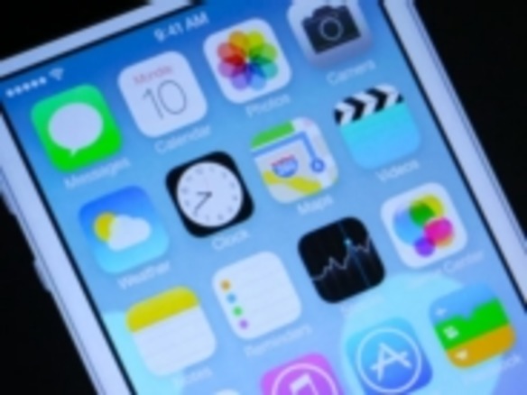
註3 First of all, many of the new icons were primarily designed by members of Apple’s marketing and communications department, not the app design teams. From what we’ve heard, SVP of Design Jony Ive (also now Apple’s head of Human Interaction) brought the print and web marketing design team in to set the look and color palette of the stock app icons. They then handed those off to the app design teams who did their own work on the ‘interiors’, with those palettes as a guide. ・Why does the design of iOS 7 look so different? - TNW
註4 ・Love and Hate for Apple’s New Mobile Software - NYTimes
註5 "This is iOS as re-imagined by a graphic designer. Non-obvious, undiscoverable interactions, extremely poor iconography, over-Helveticated." このSebstiaan de Withなる人物、肩書きの欄(自己紹介)には「doubleTwist (というアプリメーカーの)チーフ・クリエイティブ・オフィサー」とある。
註6 "You gotta wonder if they took their phones outside and looked at all that thin-lined icon + transparency stuff in the sunlight."
註7 ・Apple's Rising Star: Craig Federighi - WSJ
註8 ・THREE WAYS WE HOPED THE IPAD WOULD BE BETTER (BUT WASN’T) - iFixit ・Unsustainable Design: Apple's Perpetuation of "Throw-Away" Culture
註9 The work on design and development is still going full tilt, and what was presented this week is firmly a ‘work in progress’. We’re told, for instance, that some builds of iOS used onstage at the conference by presenters are already newer than the ones pushed out on Monday. Of the various aspects of iOS 7, the design of its icons and other visual cues are the most in flux at the moment. There are still refinements and conversations going on around them. I don’t know but would expect there to be a lot of fixes for the inconsistency we’re seeing in things like gradients and design language on the home screen. ・Why does the design of iOS 7 look so different? - TNW
註10 もっと明け透けな言い方で、たとえば「アイコンなどのフラット化はWindows Phone、Windows 8への賛辞」とか「マルチタスク画面はwebOSのもの真似、またコントロールセンターはAndroidのもの真似」などと評する声も。・Apple Flatters Microsoft With Imitation - Businessweek ・Tracing iOS 7's influences: Apple remixes almost everyone in the industry - The Verge