ウィジットの完成度と応用性
前回も紹介したが、筆者がSpryで最も魅力的に感じているのは、豊富なウィジットだ。アコーディオンパネルやタブビューを簡単に構築することができる。また、他のライブラリでは、CSSが既存のものに干渉してしまい、ウィジットの見た目が崩れてしまったり、既存ページ内の要素が崩れてしまうということが多々あったのだ。
しかし、Spryの場合は今までそのようなケースに当たってしまったことはない。クラスによってCSSが明確に定義されており、どこに組み込んでもclass属性で適切にスタイルが適用されるようになっている。また、例えば次のCSSファイルを見てみよう。
@charset "UTF-8";

/* SpryAccordion.css - Revision: Spry Preview Release 1.4 */

/* Copyright (c) 2006. Adobe Systems Incorporated. All rights reserved. */

/* This is the selector for the main Accordion container. For our default style,
 * we draw borders on the left, right, and bottom. The top border of the Accordion
 * will be rendered by the first AccordionPanelTab which never moves.
 *
 * If you want to constrain the width of the Accordion widget, set a width on
 * the Accordion container. By default, our accordion expands horizontally to fill
 * up available space.
 *
 * The name of the class ("Accordion") used in this selector is not necessary
 * to make the widget function. You can use any class name you want to style the
 * Accordion container.
 */
.Accordion {
    border-left: solid 1px gray;
    border-right: solid 1px black;
    border-bottom: solid 1px gray;
    overflow: hidden;
}

/* This is the selector for the AccordionPanel container which houses the
 * panel tab and a panel content area. It doesn't render visually, but we
 * make sure that it has zero margin and padding.
 *
 * The name of the class ("AccordionPanel") used in this selector is not necessary
 * to make the widget function. You can use any class name you want to style an
 * accordion panel container.
*/
.AccordionPanel {
    margin: 0px;
    padding: 0px;
}
...
これは、アコーディオンウィジット用のCSSファイルの一部である。これを見ると、コメントが適切に作られている上、クラス名も分かりやすくなっているため、改造が容易である。実際、ウィジットを実践に使ってみても、かなりカスタマイズを施して、オリジナルのパーツとして使うことができた。
組み込みの方法であるが、スクリプトは以下のようになっている。
アコーディオンウィジットを使う
1つめのコンテンツ
1つめのコンテンツの内容です
2つめのコンテンツ
2つめのコンテンツの内容です
またもや、JavaScriptはbody要素の一番下に1行あるだけである。これだけで、美しいエフェクトでアコーディオンが開閉するのだ(図4)。これを見たときは筆者は感動してしまった。
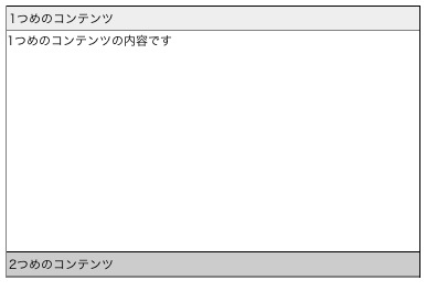 図4:簡単な記述でアコーディオンを実現